
The LinkedIn Banner Nobody Talks About — and How to Make Yours Match Your Headshot
Almost nobody uses their LinkedIn banner well.
I scroll my own feed and the pattern is brutal: stock Manhattan skyline, stock Philadelphia bridge, stock cityscape that has nothing to do with the person, sometimes a default LinkedIn-blue gradient that signals I never customized this.
The banner is 1584 by 396 pixels. That’s a billboard at the top of your profile, sitting directly above the photo recruiters and clients are about to look at. Most professionals leave it as digital throat-clearing.
Here’s how to use it instead.
What the Banner Actually Is
LinkedIn’s banner is a 4:1 horizontal strip across the top of your profile. On desktop it stretches the full width of the page. On mobile it crops to a square-ish area in the center. So the rule is: anything you care about goes near the middle. The corners get clipped.
The banner sits about an inch above your profile photo on most screens. The two are read together in the same glance. That’s the whole reason this matters — the banner isn’t a separate visual moment. It’s the frame around your face.
Three Banners That Work
Option one: an environmental shot. A wide frame of you at work, on-site, in the studio, in the conference room, behind the bar, on the construction site, in the operating room. Not a posed photo — a working photo. Cropped wide so your face stays the headshot’s job and the banner shows context. This is the most powerful option for senior professionals because it answers the question what does this person actually do all day.
Option two: a clean color or texture. A wide horizontal sweep of color that complements your headshot’s backdrop. If your headshot is on dark grey, your banner could be a darker grey that fades to charcoal. If your headshot is on white, your banner could be a clean off-white with a subtle texture. Color-matched banners read as intentional and high-design without saying anything literal. Bonus: they don’t go out of date the way a city skyline does.
Option three: a horizontal element with text. Your firm wordmark, a tagline, a list of services in a clean sans-serif. This works well for solo practitioners, consultants, and personal-brand-driven roles. The text needs to be set well — bad typography in the banner reads worse than no banner at all.
What Goes Wrong
Stock skylines. Including the Philadelphia skyline. I am from Philadelphia and I love this city. The stock Liberty Bell-and-skyline shot is everywhere, it’s free on Unsplash, and using it tells recruiters you spent zero seconds on your banner.
Multi-image collages without a clear focal point. Stitching together three or four photos can absolutely work — when each frame is strong, the spacing is intentional, and there’s a clear hierarchy that pulls the eye to one anchor. The version that doesn’t work is when the images compete for attention, the layout feels arbitrary, or the watermark sits dead-center where mobile crops it off. Treat a collage as a single composed image, not a strip of separate ones.
Centered text or watermarks. LinkedIn crops the banner aggressively on mobile — roughly the outer thirds of the banner can disappear depending on screen size. If the most important text in your banner sits in the exact center, it survives desktop fine and gets clipped on phones. Move important copy slightly off-center, or position it in the lower third where mobile reliably renders it.
Low-resolution images. Anything under 1584 pixels wide will look soft. LinkedIn’s compression is also unforgiving, so you want to upload sharper than seems necessary.
Banners that compete with your face. A bright red banner above a dark grey headshot creates visual tension and pulls the eye away from your face. The banner’s job is to support your headshot, not steal from it.
Anything with a child, pet, or partner in it that isn’t connected to your professional work. I’m a vet; I love your dog. Your dog does not belong on your LinkedIn banner unless your work involves dogs.
The Pairing Move
The most effective banner-and-headshot combinations I see use one of two strategies:
Color continuity. The banner picks up a color from your headshot’s backdrop and extends it. If your headshot is on a deep navy backdrop, your banner is a deep navy texture or environment. The two read as one designed thing. Recruiters skim past most profiles. They stop on profiles that look composed.
Context continuity. The headshot is studio. The banner is on-location. So the headshot says here is the person and the banner says here is where the person works. This pairing is especially strong for executives, partners, and founders whose role is tied to a place — a firm, a campus, a flagship.
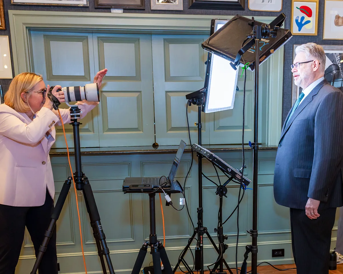
I photograph wide banner-format frames during executive sessions specifically for this purpose. One session, one cohesive set, one designed look across both pieces of LinkedIn real estate.
The Five-Minute Banner Audit
Open your LinkedIn profile right now. Look at your banner and ask:
- Does it say something about my work?
- Does it support my headshot or compete with it?
- Is the resolution sharp?
- Would a recruiter who’s never met me get useful information from it?
If you said no to any of these, the banner is doing less than nothing. It’s a missed cue at the top of your most-viewed page.
Want a headshot session that includes a paired LinkedIn banner? Book a session at my Eagle Yards studio in Wayne — five minutes from King of Prussia along the Route 202 corridor. Or view pricing for executive packages that include banner-format imagery.
Ready for Your Professional Headshot?
Book your session today and get the perfect headshot that represents you professionally.
View Pricing & Book